CLIENT:
Personal Project
PROJECT:
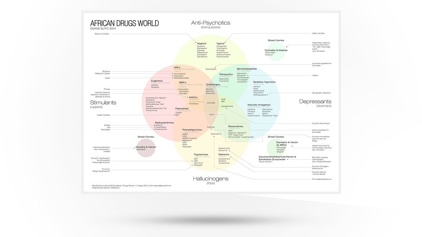
African Drugs Data visualization
David McCandless’ seminal work on data visualization, “Information is Beautiful,” presents an exceptional (but slightly Eurocentric) infographic, “Drugs World.” I wanted to adapt this smart piece of data visualization to an African context to make it more useful to folks working in the field of addiction in South Africa–as an African Drugs Data visualization tool.
McCandless’ version was a little Eurocentric and lacked real-world, African application (a number of the drugs have different brand names in Africa, and the African street drugs weren’t included). I don’t really think McCandless’s original infographic was attempting such a specific application when it was conceived. His starting point for this, however, remains an exceptional launchpad.
I drew on the expertise of a friendly GP who assisted with the translation of European/South African drug names and applications, added the street drugs and, using McCandless’ graphic as a starting point, updated the information and gave the design a bit of a tweak.
If you are working in addiction and need a copy of the African Drugs Data Visualization for your office, there are two versions hosted here; please feel free to grab yourself a copy if you are in need of one.
PDF Version – good for printing a poster
PNG Version – good for reading on a screen

