Data Design for Slide Decks
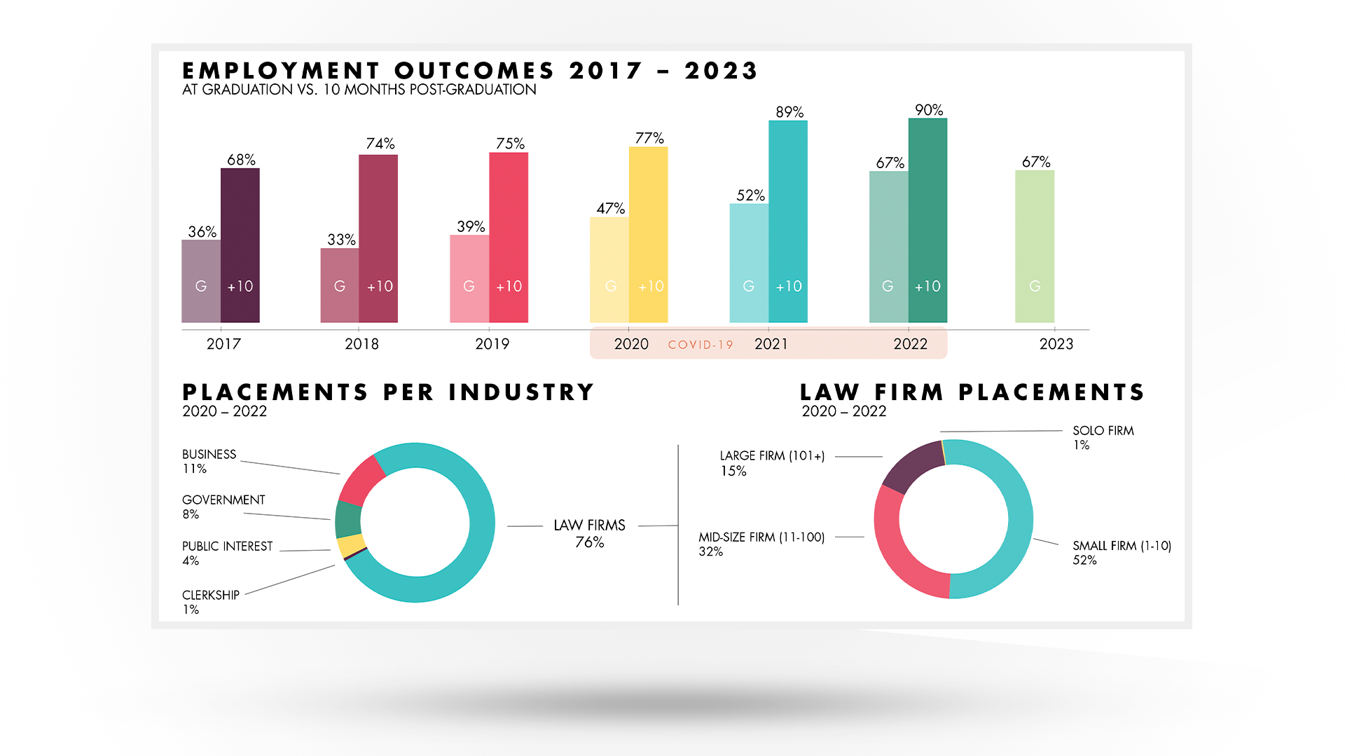
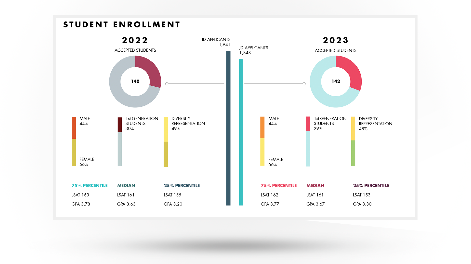
It’s a challenge getting a lot of information onto a slide that can be a five-minute talking point. Multiple charts infer connection between data points and prompt questions and discussion.
CLIENT:
Chapman University Fowler School of Law
PROJECT:
Data Visualization: Enrollment and Employment Metrics
Endless slide presentations make me want to die, and not in a good way. You may feel much the same way when trapped in such a presentation.
My motto when it comes to creating slides and, in particular, data design for slide decks is simple:
Be brief. Be brilliant. Be gone.
Drawing on the brilliant work of Edward Tufte, my goal with data design for slide decks is to simplify and condense as much information as possible into as few slides as possible. This approach prompts the audience to see connections in the data and promotes questions and discussion (rather than simply supporting a monologue), all of which is easier said than done.
“Fewer slides” does not mean quicker presentations – it means more in-depth and engaging presentations if done correctly. It also forces the presenter to engage directly with their audience about the data findings as opposed to simply reading the slides to them, which is a pet hate of mine, and quite likely yours too.
The “gotcha” here is that you have to really, truly understand your data or none of this works. As usual, everything comes back to a thorough research and learning process at the very start of the project.


