
DATA VISUALIZATION: US SUPREME COURT DECISIONS 2025
Supreme Court decisions present an excellent opportunity to present complex data in a digestible way through data visualization. The principal resource for this was SCOTUS Blog, an outstanding summary of Supreme Court rulings, featuring a timeline of each ruling with commentary – well worth a visit if you enjoy following the process. The hard part wasn’t data collection or synthesis; it was ensuring that the data was presented in the most non-partisan manner possible.
CLIENT:
FSOL
PROJECT:
Data Visualization: Select US Supreme Court Decisions 2025
For the second annual SCOTUS in Focus discussion panel, I wanted to create an infographic that clearly illustrated each case under discussion, so that even the most uninitiated member of the audience could follow along with the panel discussion.
There was just one problem: In 2025, the US Supreme Court itself had become something of a partisan political hot potato, raising the question of how to display data points about how the judges voted and decided each case in a non-partisan manner.
Inspired by the inimitable Professor Lee Epstein’s data-driven keynote at the inaugural SCOTUC in Focus panel discussion the year before, and drawing heavily on the truly excellent coverage available about each case appearing before SCOTUS at SCOTUS Blog, I created the data visualization you see above.
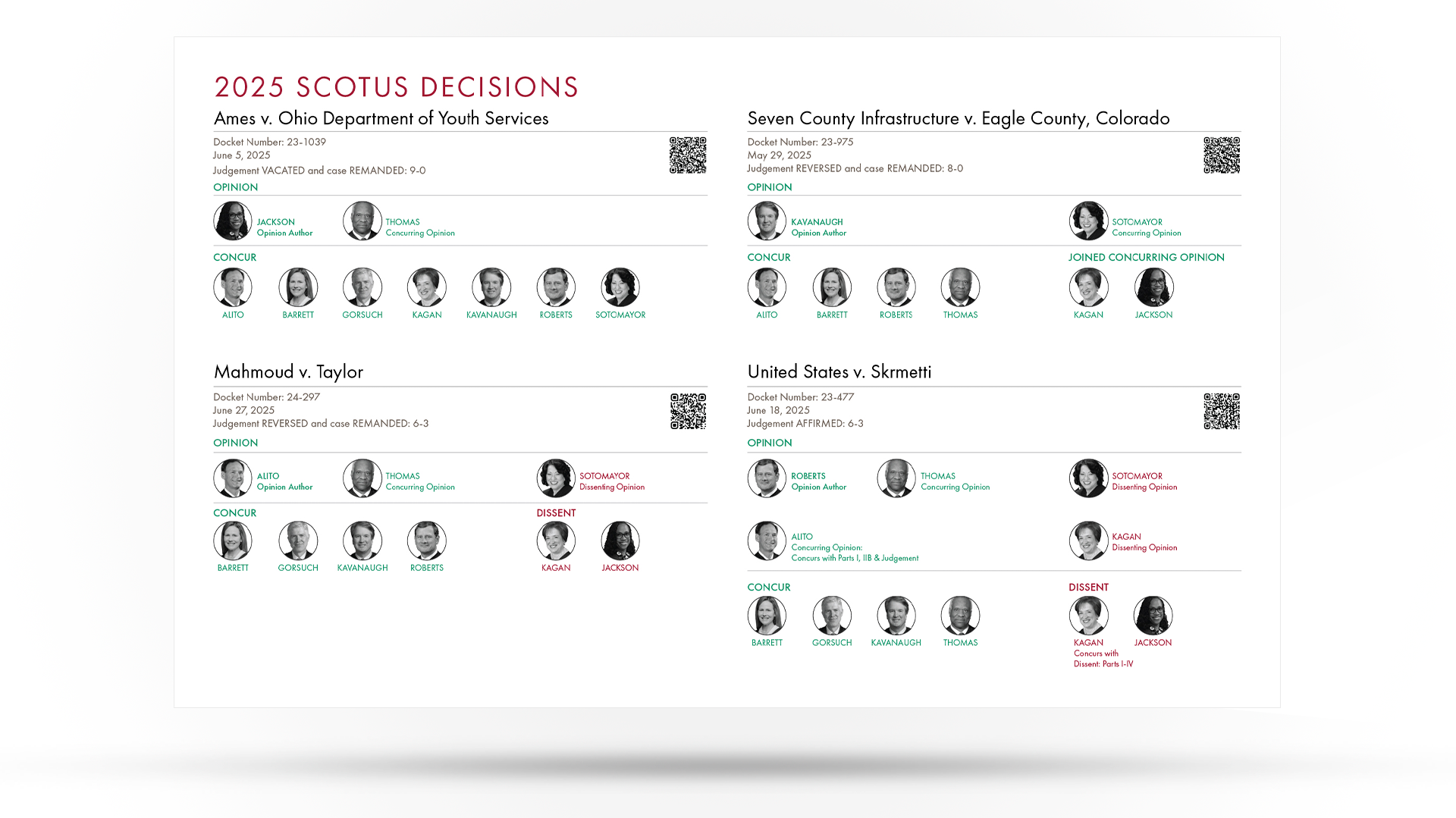
Almost all the SCOTUS data visualization graphics I encountered in my research had the same tendency: illustrating SCOTUS decisions only along political (Red v. Blue) lines. Decisions were either “Conservative” (Red) or “Liberal (Blue), and this design choice didn’t assist the data presentation; in fact, it confused it.
Using brand colors, I grouped judges and split decisions into “For” (green) and “Against” (red), to illustrate the various concurring and dissenting positions of the justices. A more helpful view of the data emerged from this structure that I hadn’t anticipated in my original draft sketches of the chart: The viewer could see where the law was settled on a particular issue, and where the judges were still figuring out aspects of the law in these cases.
For example, Ames v. Ohio, was decided unanimously (9-0) with two opinions. Irrespective of conservative or liberal bias, the judges were in complete agreement on this case–clearly, law that is well established and settled here (there probably should have only been one opinion here, but Justice Thomas can’t seem to help himself and almost always writes his own opinion on cases).
Contrast this with United States v. Skrmetti, where the court delivered a split (6-3) decision, and there are six opinions (three concurring, two dissenting, and one concurring and dissenting)–the justices are clearly still grappling with aspects of the law in this case. But this in itself introduces a new idea to the reader: The law is a living thing, in flux and subject to change as the social and cultural order itself changes. To paraphrase an especially beautiful quote from former President Barack Obama, the law is a record of “a country grappling with its own conscience.” SCOTUS gives us a timeline of this, etched out in case history. What a beautiful idea!
I added a QR code link to SCOTUS Blog for each case so the audience could follow along on their mobile devices if they wanted. The additional multimedia experience deepens engagement with the panelists’ presentations, providing audience members with additional data points and information that panelists might otherwise omit due to time constraints.
See how this infographic complements the finished program.
