Brand Guide, Logo & App Icon Design: Mobi
Mobi is an app for the healthcare space that was in need of a cohesive brand identity and a great logo that would translate into a great application icon.
CLIENT:
Mobi
PROJECT:
Brand Guide, Logo & App Icon Design
Mobi is a mobile device application aimed at the healthcare space. Although well-conceived and expertly positioned by its founders, they found themselves struggling with the creative elements of logo, brand design and brand building, which is always a difficult task. I worked closely with the amazing team behind Mobi to define a color palette, typography, a brand logo and icon that would define their mission and give them a simple, identifiable brand mark.
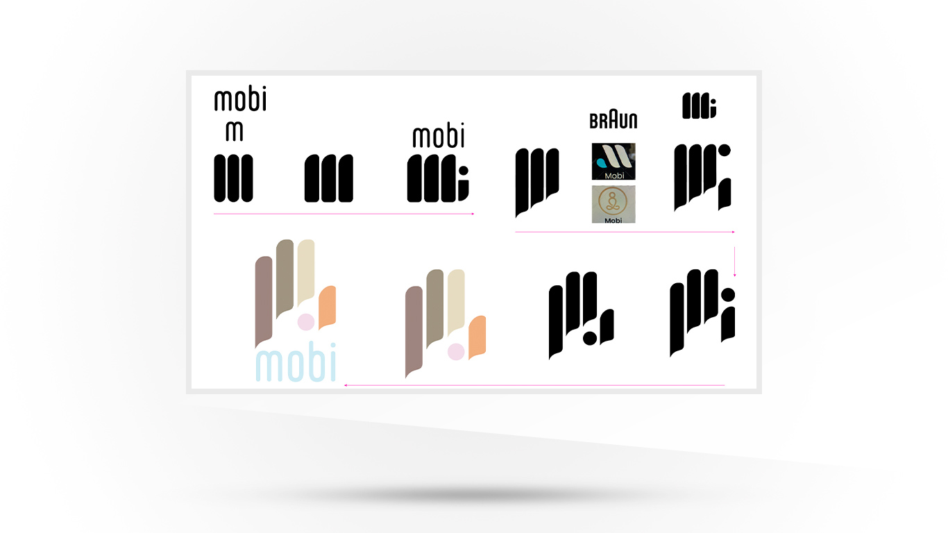
With a very tight deadline hanging over us we worked up a logo which incorporated the idea of caring hands, with a ‘feminine touch,’ which would be recognizable and easy for the intended audience to identify with.
The evolution of the brand design, from the simple “m” of Mobi through to the final iteration of the M-hand shows how, over numerous sketches, the mark evolved into a recognizable entity, novel and with the ability to stand on it’s own in a sea of other brand marks. The typography evolved out of the founder’s favorite fonts and the pragmatic use of open-source fonts. Lastly, I collated this all into a brand guide for them, to start the ball rolling and, hopefully, grow with them as the business develops.


