
INFOGRAPHIC DESIGN: NESPRESSO PODIODIC TABLE
After futzing with the silly Nespresso booklet I created this one-page infographic to assist the perplexed choose the correct dosage for their coffee fix. I still get requests for this from folks online.
CLIENT:
Personal Project
PROJECT:
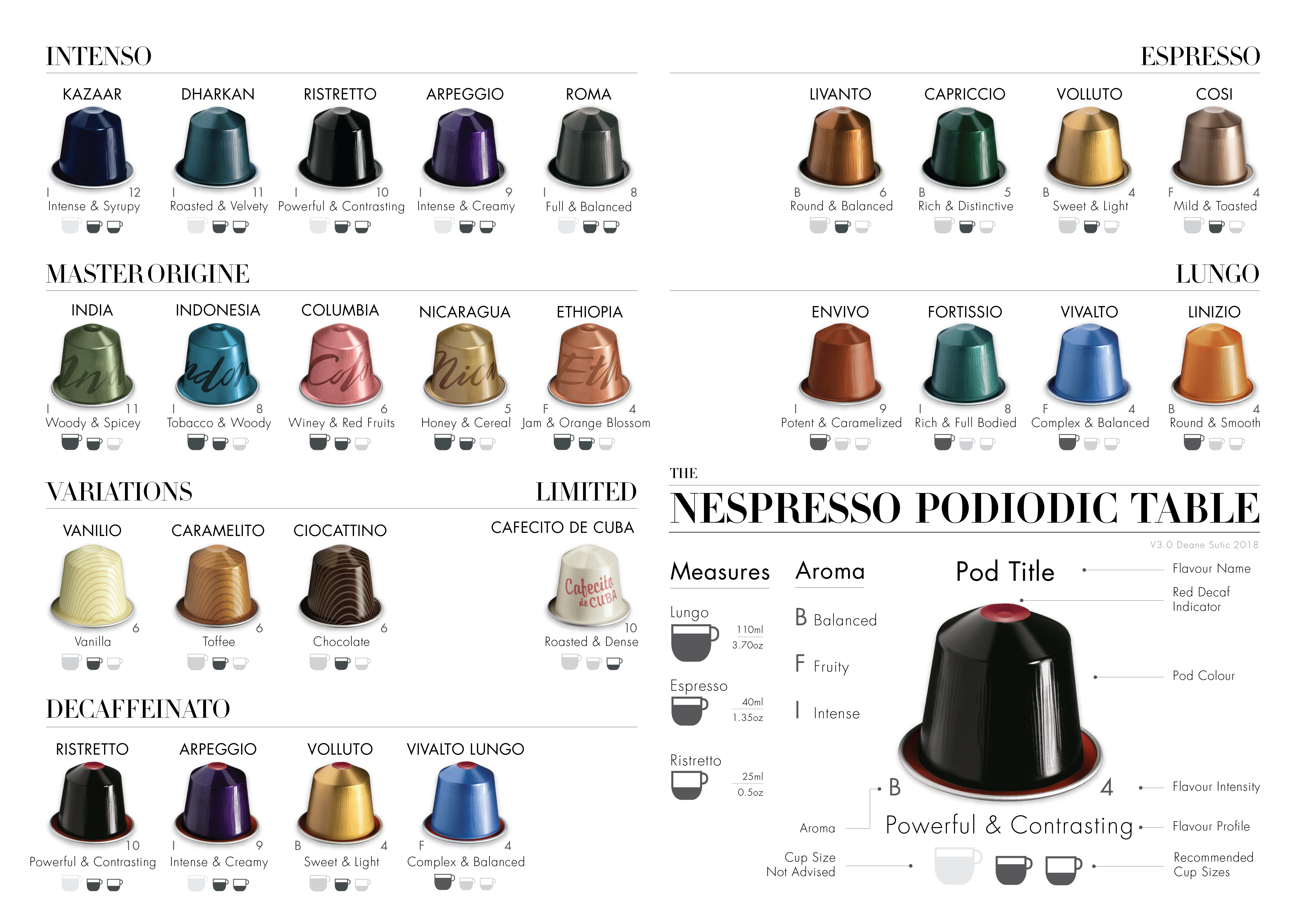
I created the Nespresso Podiodic Table infographic in 2015 after a friend proudly showed off his shiny new Nespresso machine to me and we fell down a rabbit hole trying to pick a flavor. You may know this feeling yourself.
The original idea behind the table was to create an A3-sized page which presented all the Nespresso Pods at a glance. One needed to see the flavor profile and intensity of each pod without having to resort to Nescafe’s little book. The simplest solution was to create a periodic–or “podiodic” table. It is a simple system: You hit the chart. The perfect pod hits the percolator. The coffee hits you. The balance of the universe is restored and life can continue. Easy-peasy. Fancy-pantsy.
Grab a download of the PNG version of the table for your phone/tablet
Email me if you want a high quality print version to frame for your coffee station.
